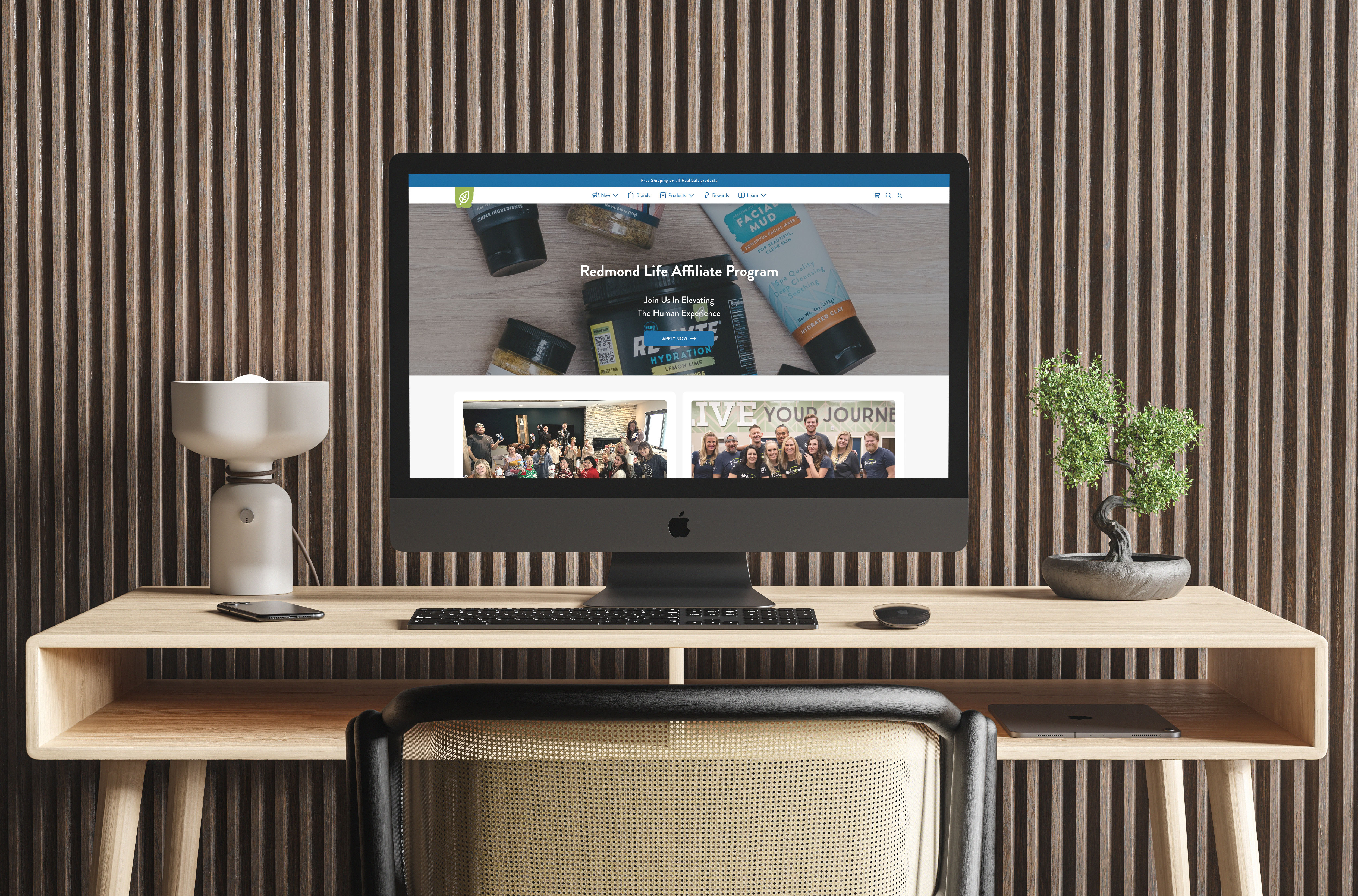
About the project
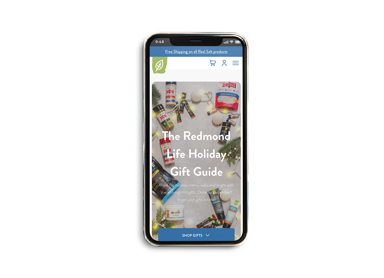
In early 2022, I took part in the redesign initiative at Pixel Productions for Redmond Life's live e-commerce site. This consists on revamping current pages that populate the site; some new pages of interest made were product releases, a gift program for customers, a social media resource page for affiliates and seasonal pages.
Research
In order to state the direction of the revamp, the lead team and I relied on the client's digital marketing director to state what pages are priority in terms of redesign as well as new pages to implement to the current site. From there, the project manager would delegate the project to the team where I was tasked in finding potential changes in the site based on a competitive analysis made by myself with the help of the client's chief marketing officer.
Information architecture
After the analysis, I made a proposal of a new information architecture for the site based on feedback stating that users were unable to find content. As the project progressed, new pages were added to the flow to make sure that the overall structure made sense even with new content being added by the month. This helped visualize what the users were being presented in a bird's eye view and if we needed to make any changes for any reason, instead of tasking development to make a change based on a hypothesis, the team and I could test the new change in the flow.
Interaction design
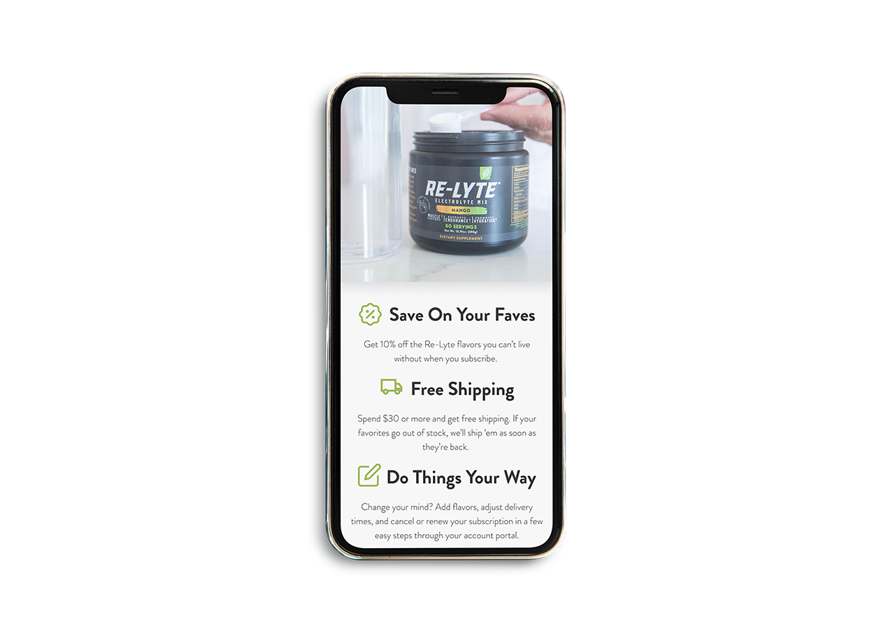
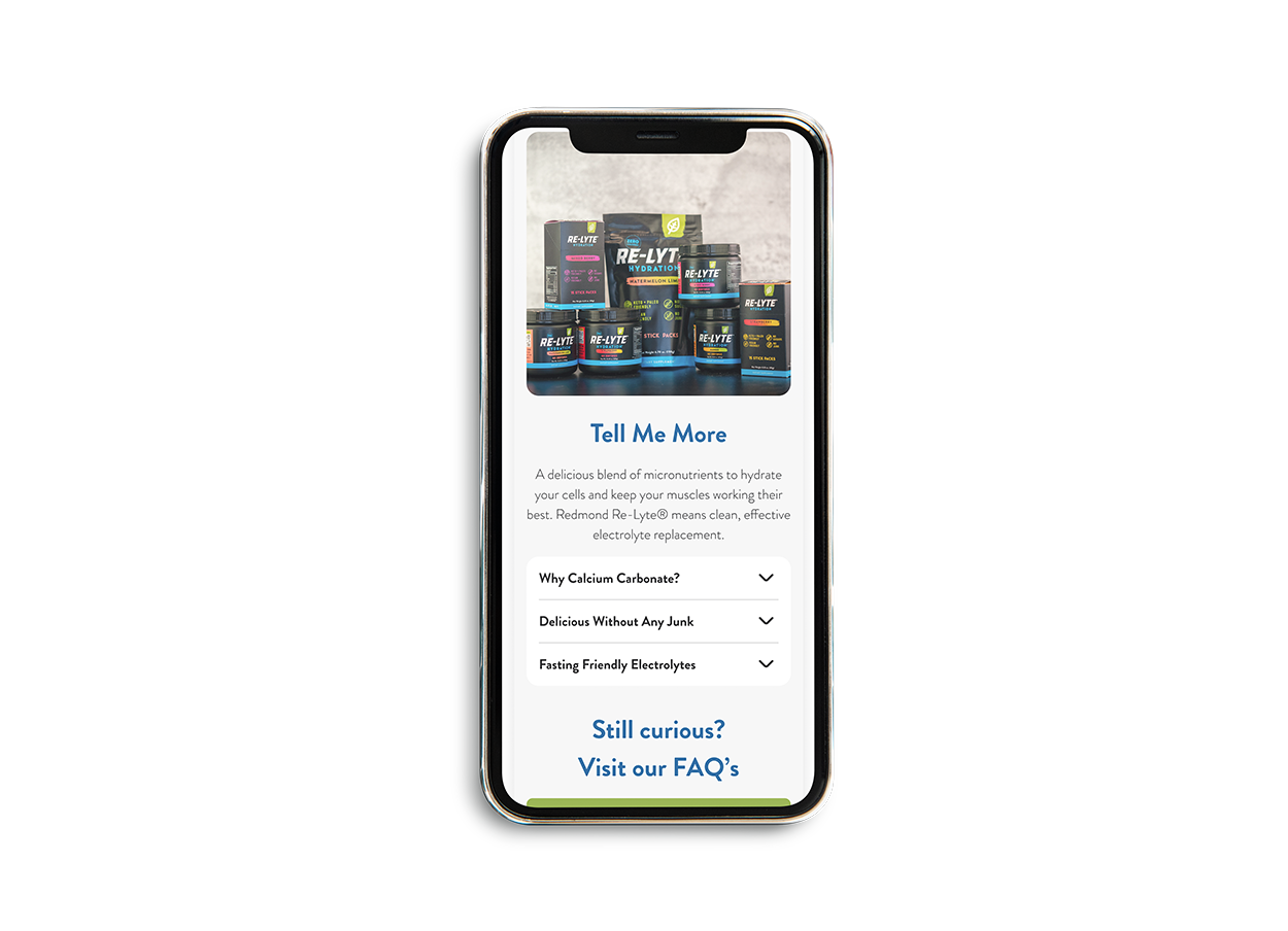
Next, I was tasked with making mid/high-fidelity wireframes of the initial pages to apply the redesign taking into account the new changes proposed from the information architecture flow from earlier. These were adapted for a mobile-first experience to assure the markup of the content would be applicable for tablet/folding devices and desktop screen sizes. As the new design options came along, the team and I would review them, iterate through necessary changes while consulting the viability of development for the new visual approach on the pages.
User interface design
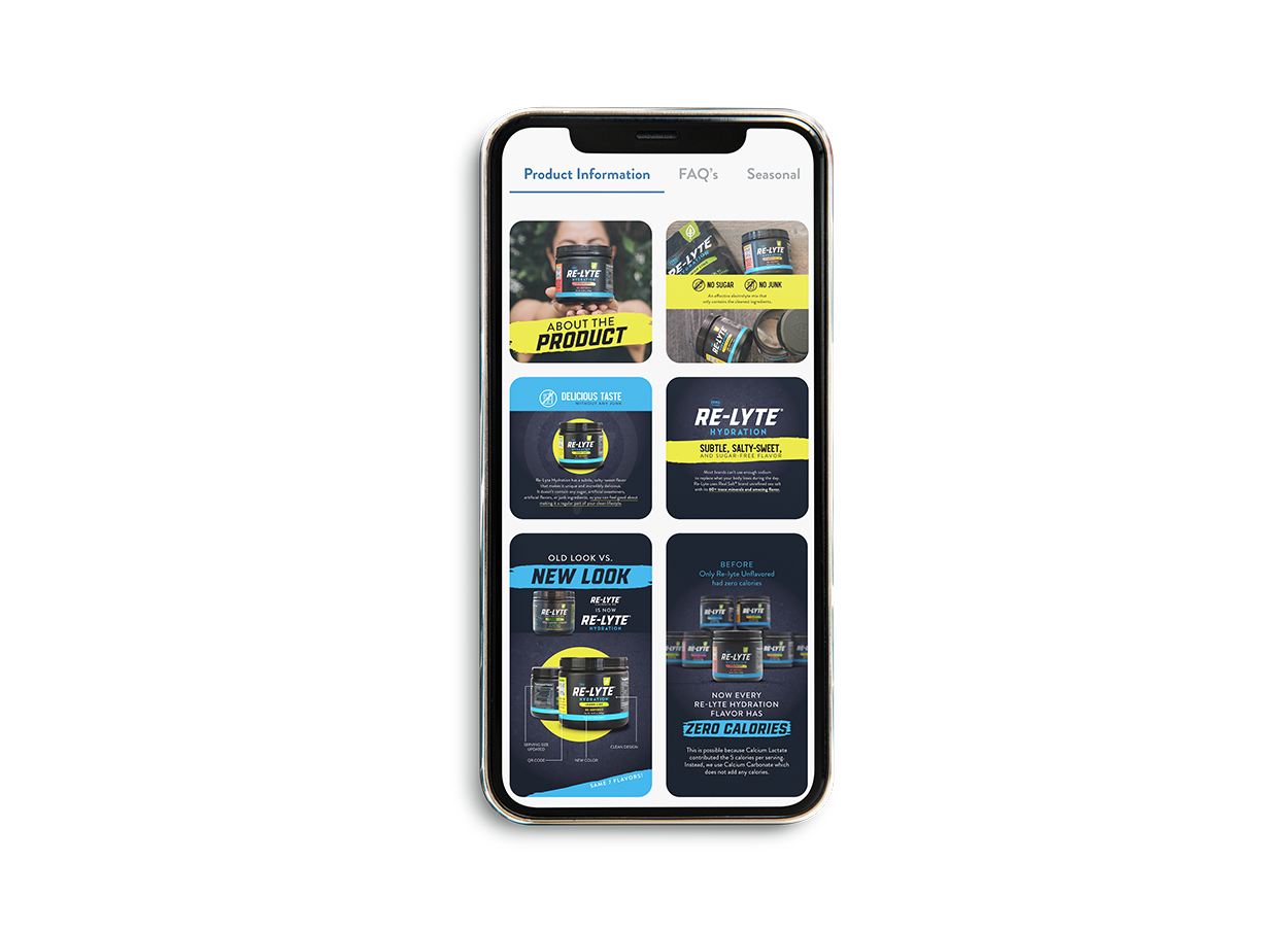
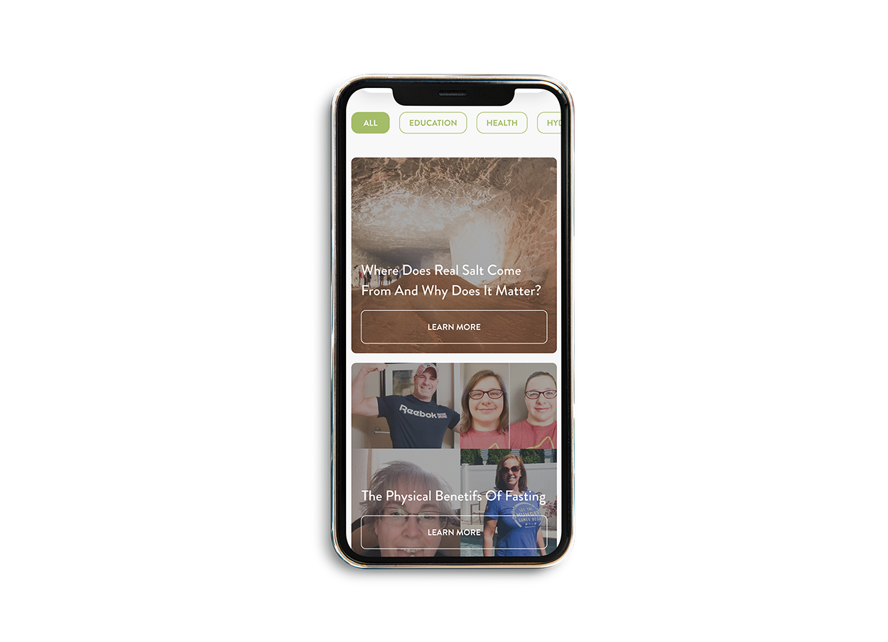
Upon the project grew bigger by the week, I decided on making a design system moving forward, afterwards making a consult with the client on the use cases and benefits with the client. The Redmond Life brand already had its typeface as well as color palette for their products and website, so I implemented these in the system while resembling similar traits from their products and social media for there to be a visual identity throughout the site. This also helped me make a standard to be applied on the pages I would apply the redesign to, as a new UI designer at the time it was easier and quicker to use a established style and component library to make sure that every site would share a similar look and feel being in colors, heading sizes, button types, padding and cards being applied or blogs, products, testimonials, and more.
Iterations
Once I had a solid foundation of the design system, it allowed the redesign process of current pages to be ready for reviewal in a shorter time frame and as new pages were implemented had the same effect. It was also of great benefit for the developers to maintain and implement existing components on all pages. This unified in a visual sense all of the pages with a refresh of its design and new information architecture as the project progressed. As new pages were added to the site, I would use existing components and if needed new changes to add to the design system. Rinse and repeat.
Pages that stood out
Results
Increase in user interactions
By establishing a standard for the look and feel of the components of the site such as button states/styling, typography sizes for content display that facilitates visualization, a suitable copy tone throughout the site, and overall a sense of control by the users by improving the site’s navigation.
longer user retainment
From the revamp of the site, users have been spending an increased amount of time on the site thanks to the implementation of white space throughout the various pages as well as showing the most important information needed at any given time based on the goals and standards set by the user.
less customer service inquiries
There has been a considerable decrease in customer service inquiries extending from placing orders, finding product information, document downloads, eventually opening the doors for staff at Redmond allocate their professional efforts elsewhere.
What I learned
keep the user’s needs top of mind
Redmond is a health brand that seeks to offer experiences their customers in the form of products that unlock their physical capabilities, with that said it must not limit the digital experience with the website that acts as the middle man for the lifestyle the users want to obtain. Which lead me and the team to ask the bigger questions, for example: What information do our customers seek the most when browsing for products online? What is the main factor that does not allow users to get to know more about the product or about the brand?
balancing knowledge with experiments
To offer a better experience for users the brand needs to experiment with new tendencies, layouts to present the user a site that they want to interact with and come back to. As a team, almost all topics in new pages, information architecture changes, product photographs have been assessed, delegated, cast aside, reevaluated and launched in short amounts of time. As my first professional experience, it was a learning curve knowing when to set limits to new ideas, keeping the team on track on the main purpose of the project and setting a standard for the projects to come.